The modern classical concept is known to be a highly elegant style, with subtle pastel tones, statement decor, and a harmonized combination of geometric and contemporary shapes.
For this grand 2,800 sqft home in Hermoso Residences, Tanjung Lumpur, this elegant design is no less fitting for a family home of five.
The clients approached Klaas Design & Build to redesign their bare unit and after a consultation for the design of their choosing, their dream home came to life.
Table of Contents
About the property
Hermoso Residences (also known as Hermoso Residences by the Sea) is a luxury residential area in Tanjung Lumpur, Kuantan developed by Tunas Land Sdn Bhd.
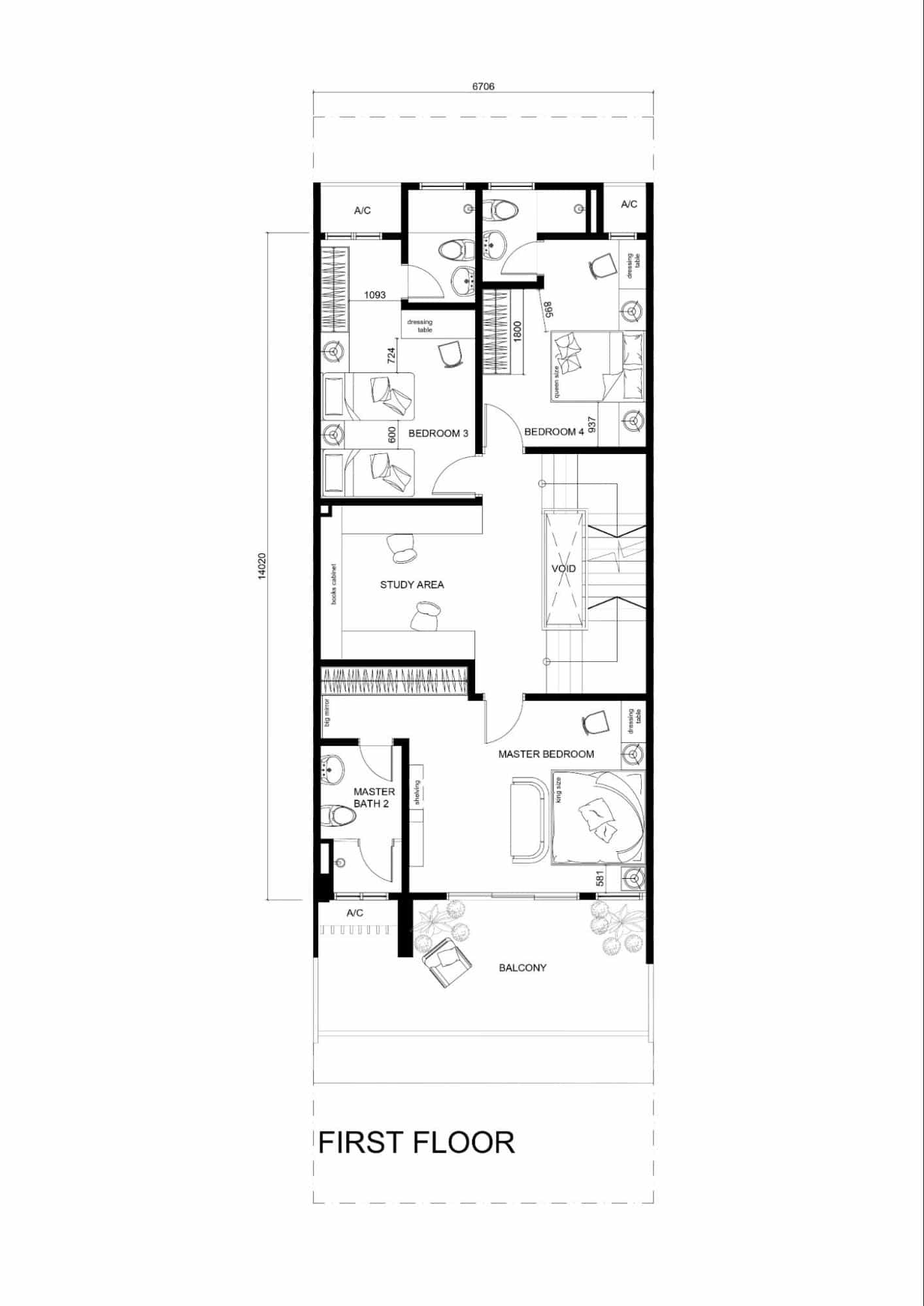
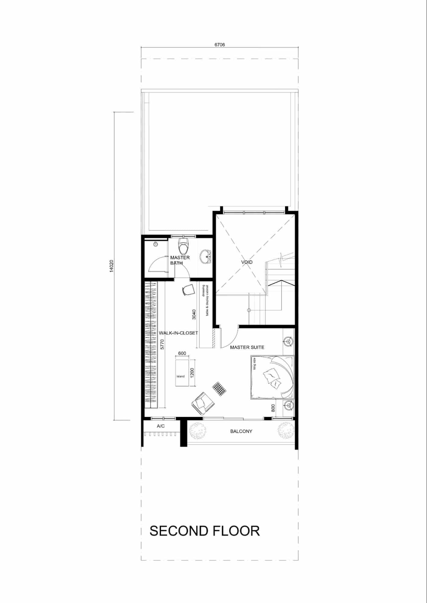
The development is known for its unique location by the beachfront and offers exclusive facilities such as a swimming pool, gym room, and clubhouse. The client’s unit is 2.5 storeys high and built up to 2,800 sqft, with 5 bedrooms and 6 baths.
A modern classical luxury
The client, a businessman living with his wife, 2 young boys, and his mother, pictured a modern classic design that he found inspiration from in interior design magazines and catalogues.
Classicism design is strongly influenced by European cultural elements, primarily in art and architecture. Its interior features range from elite traditional styles, clean wainscotting, soft pastels, ornate shapes, and gold accents.
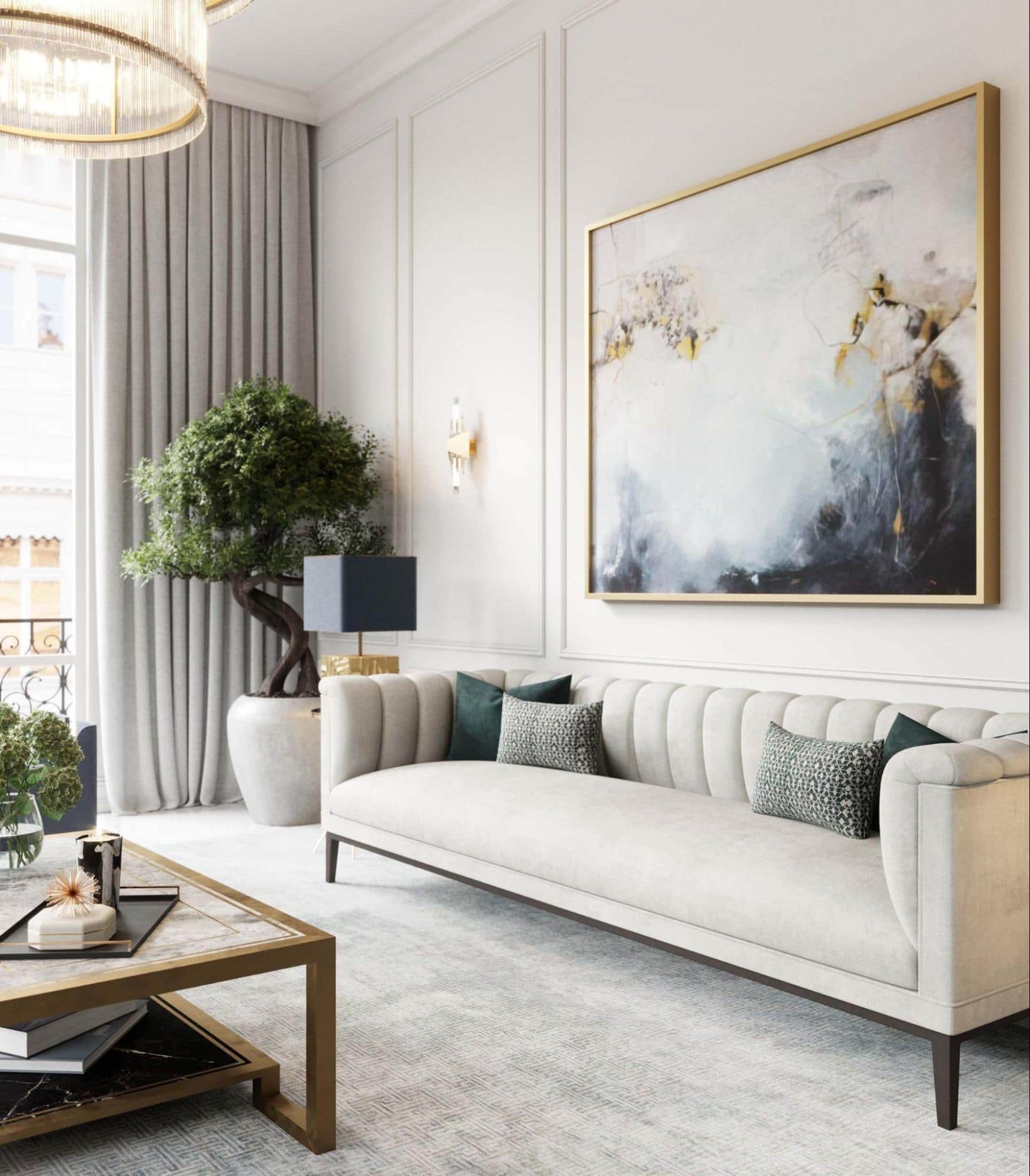
Not wanting to stray away from minimalist urban concepts either, modern classical seemed a fair middle ground.
That being said, the owner left it up to the designing team at Klaas Design & Build to take it off his hands and breathe life into this home.
Living room
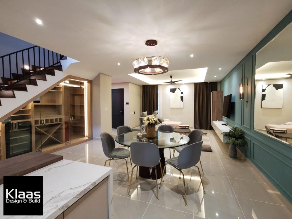
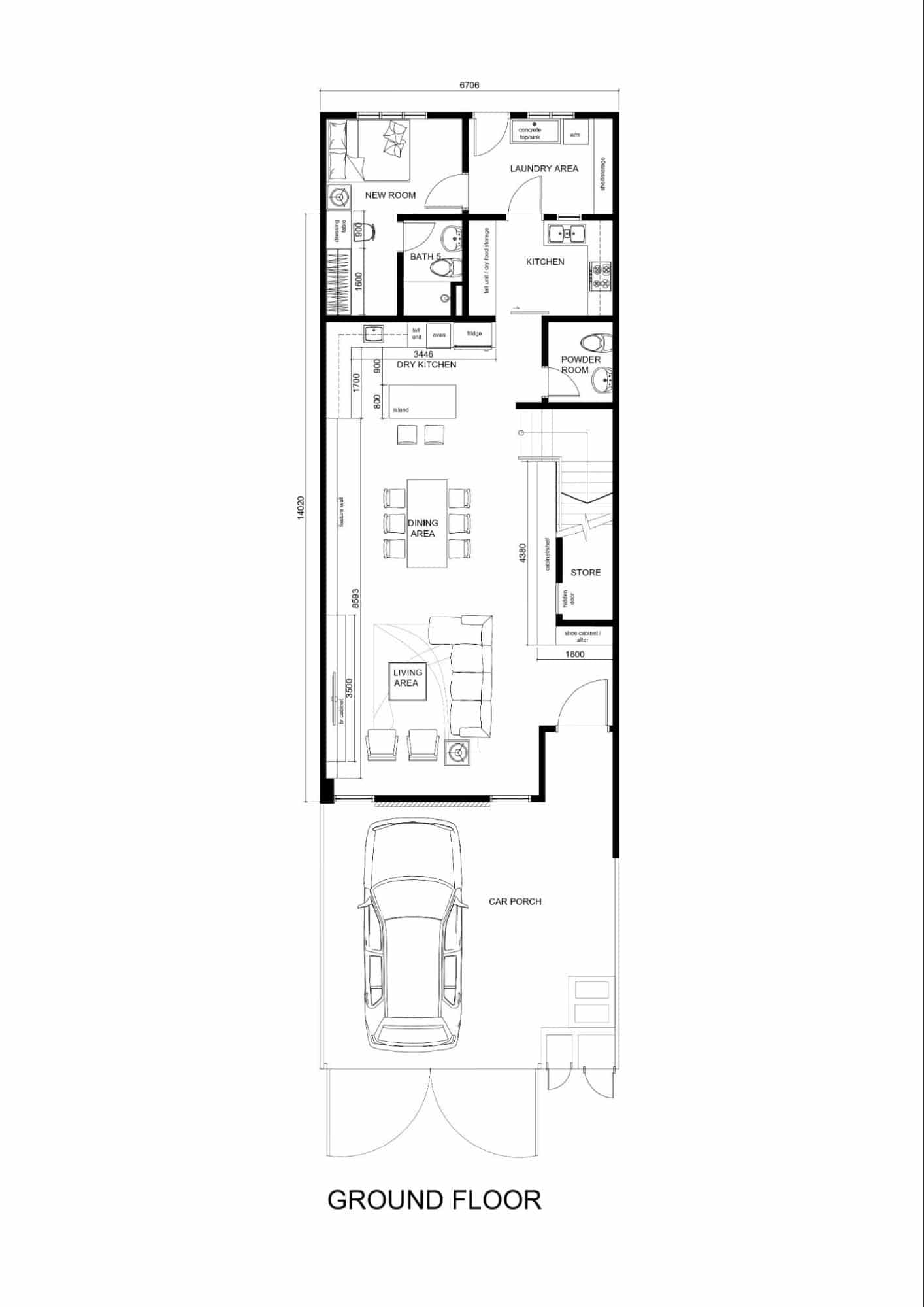
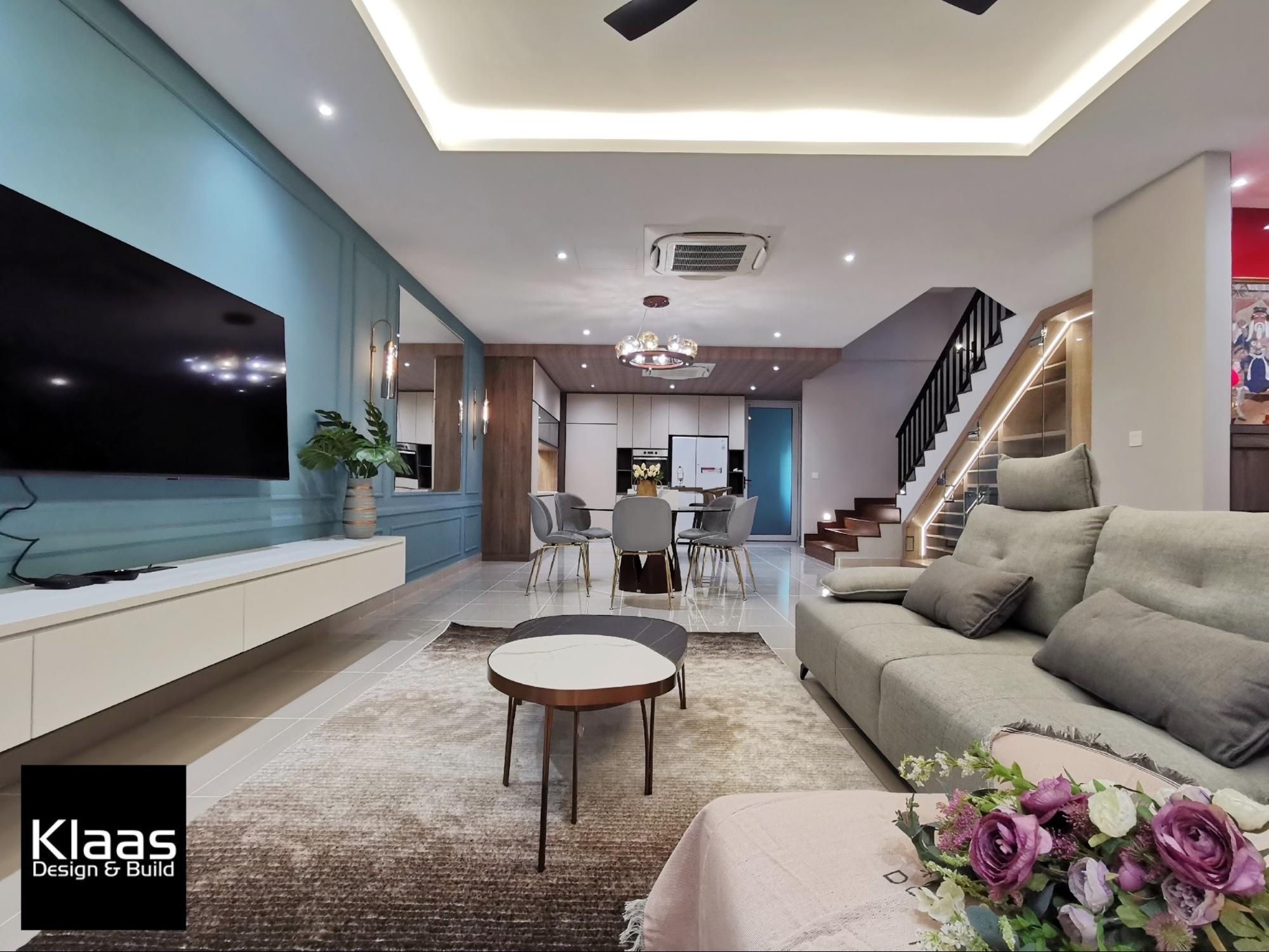
The ground floor takes an open space concept, with a breathtaking view of the delightful modern classical scenery splayed out.
The living room is greeted immediately by a large vibrant turquoise feature wall at the TV console ending right before the dry kitchen. The elegance of the wainscotting draws even more attention to the whimsical tone at play.
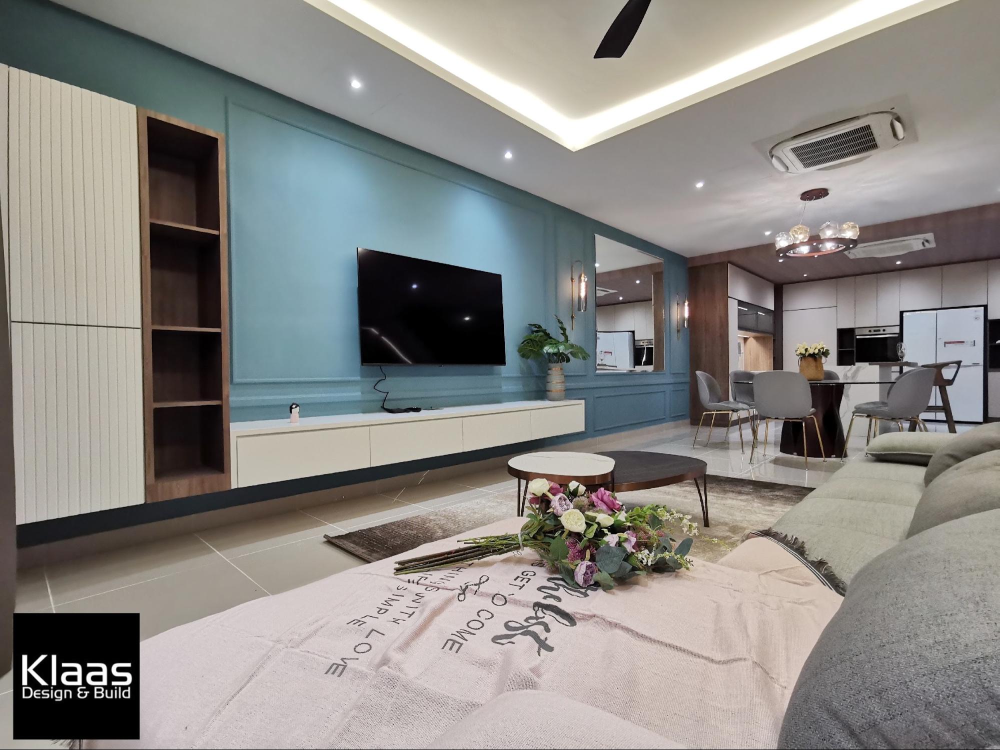
It isn’t necessarily a large room and furnishing it was no easy feat. Leslie, the interior designer of Klaas Design & Build, had mentioned there was some difficulty picking out a sofa due to the limited space. Eventually, they went for a plush L-shaped couch. It was roomy enough to seat everyone while simultaneously adding a cosy modern touch.
The small coffee table is also a versatile monochrome that perfectly matches the room’s modern aesthetic without sacrificing legroom.
Dining area
The dining area here is not given any physical indication of separation save for the dining table itself. It does, however, blend in smoothly with the room’s cohesive feel.
Above, a modern farmhouse chandelier hangs down to brighten the area. A large mirror is hung in place for the purpose of bouncing off light, therefore further illuminating the room. Modern metallic sconces flank both sides for added soft ambient lighting.
Rather than a rectangular dining table, the client opted for a round one. The designing team found this to be slightly tricky given the available space but eventually found a workaround.
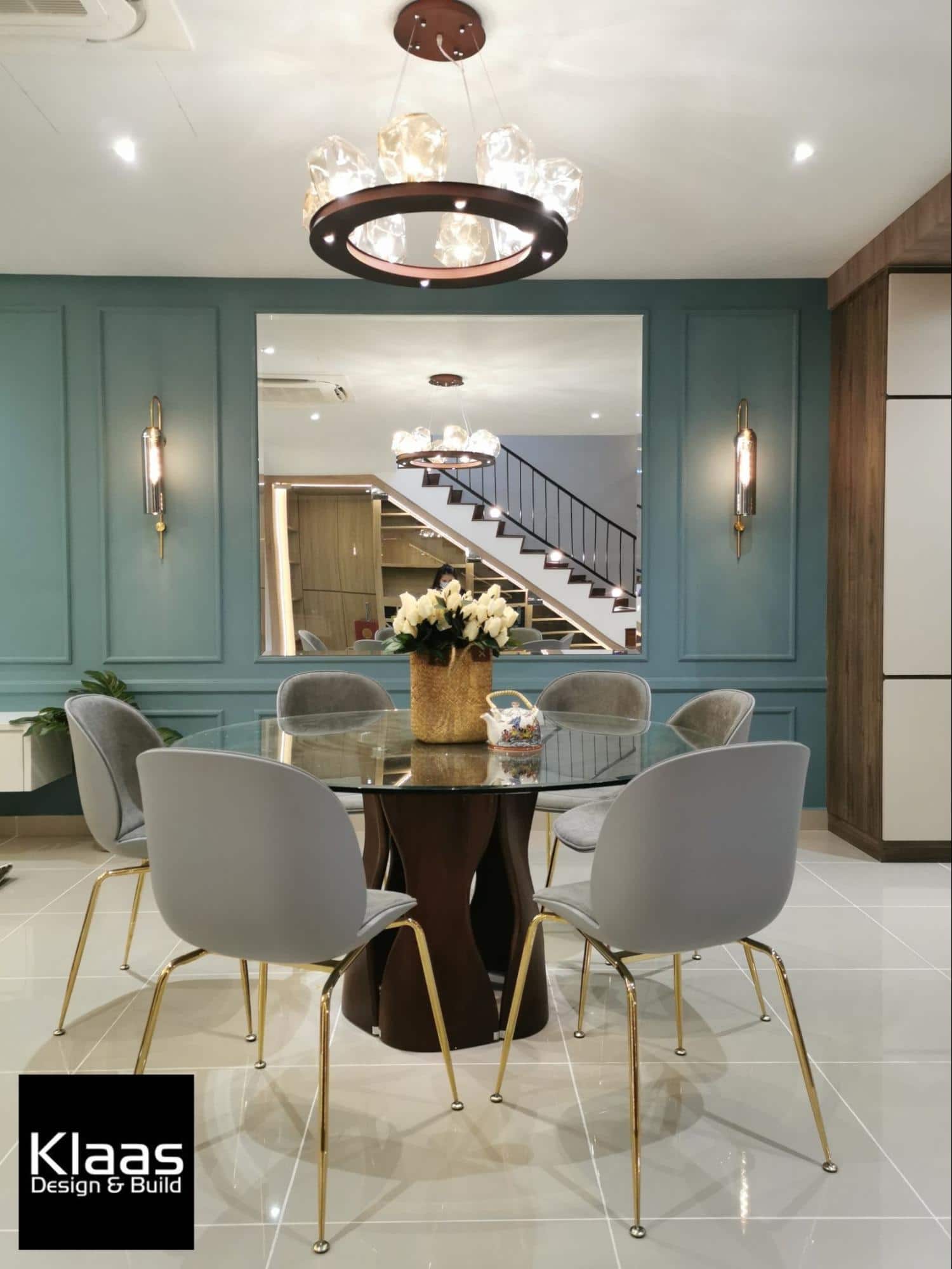
With the chair legs plated in gold, it adds a grandiose finish alongside the natural-looking wood carving of the table’s hollow pedestal.
Dry Kitchen
For this area, the team was faced with a challenge commonly found in designing terrace homes: lack of natural lighting. The dry kitchen proved to be a particularly tough spot because no windows were present.
Instead of using walls to separate the wet and dry kitchen that would block the light, they created a “zoning” with textured ceiling patterns to separate the dry kitchen from the living room.
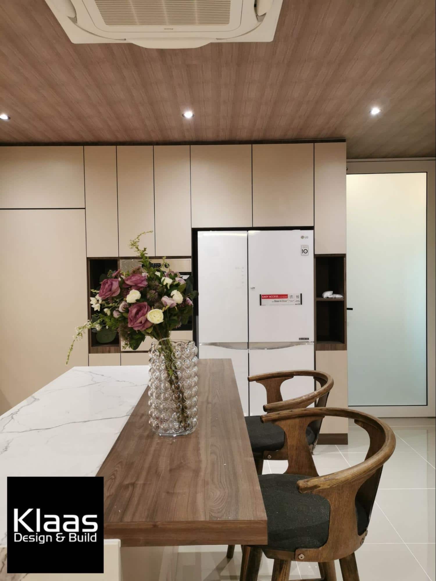
Creating a sense of division somewhat helped to brighten the usually dark corner, reinforced with skilful lighting points fixed in place. On top of that, the brown wood textures contribute a sense of character to this contemporary look.
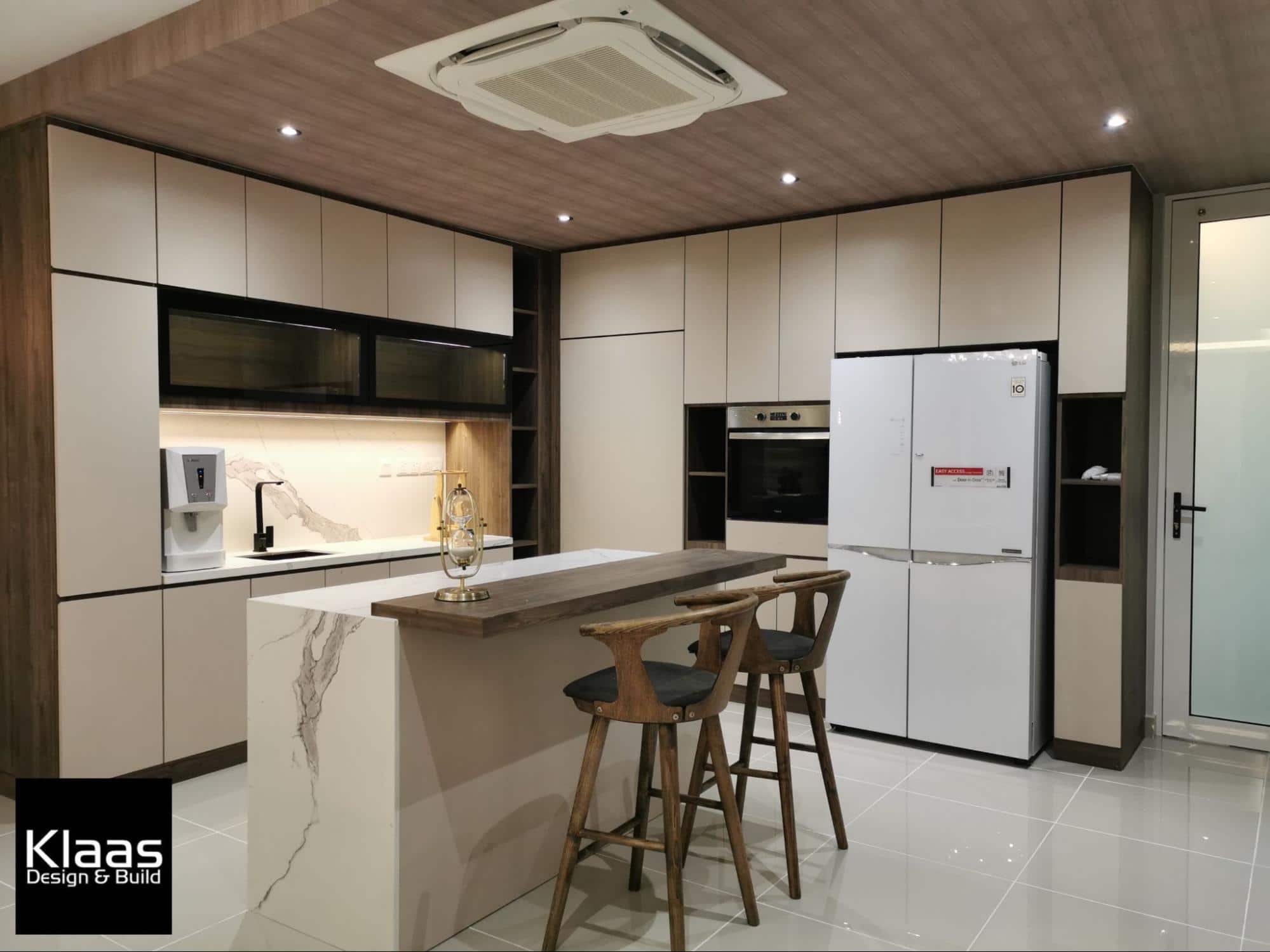
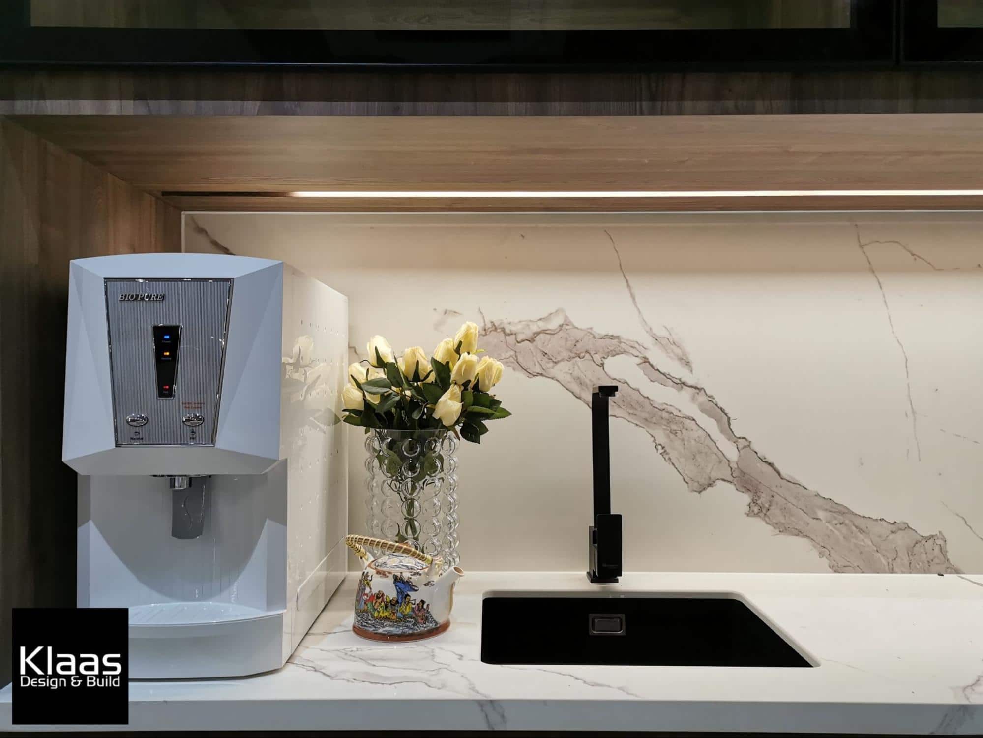
The refined facade of the dry kitchen is further accentuated with off white cabinetry lining the walls. The countertops, backsplash, and kitchen island flaunt marble streaks, capturing a soothing luxurious touch.
For a fitting contemporary look, the deep mahogany bar counter resting on the lip of the kitchen island gives a unique contrast, paired with a couple of natural wood bar stools.
Wet kitchen
The frosted glass door opens to a small wet kitchen at the back. Polished marble slabs grace the countertops elegantly, and copper-toned cabinetry to layer with.
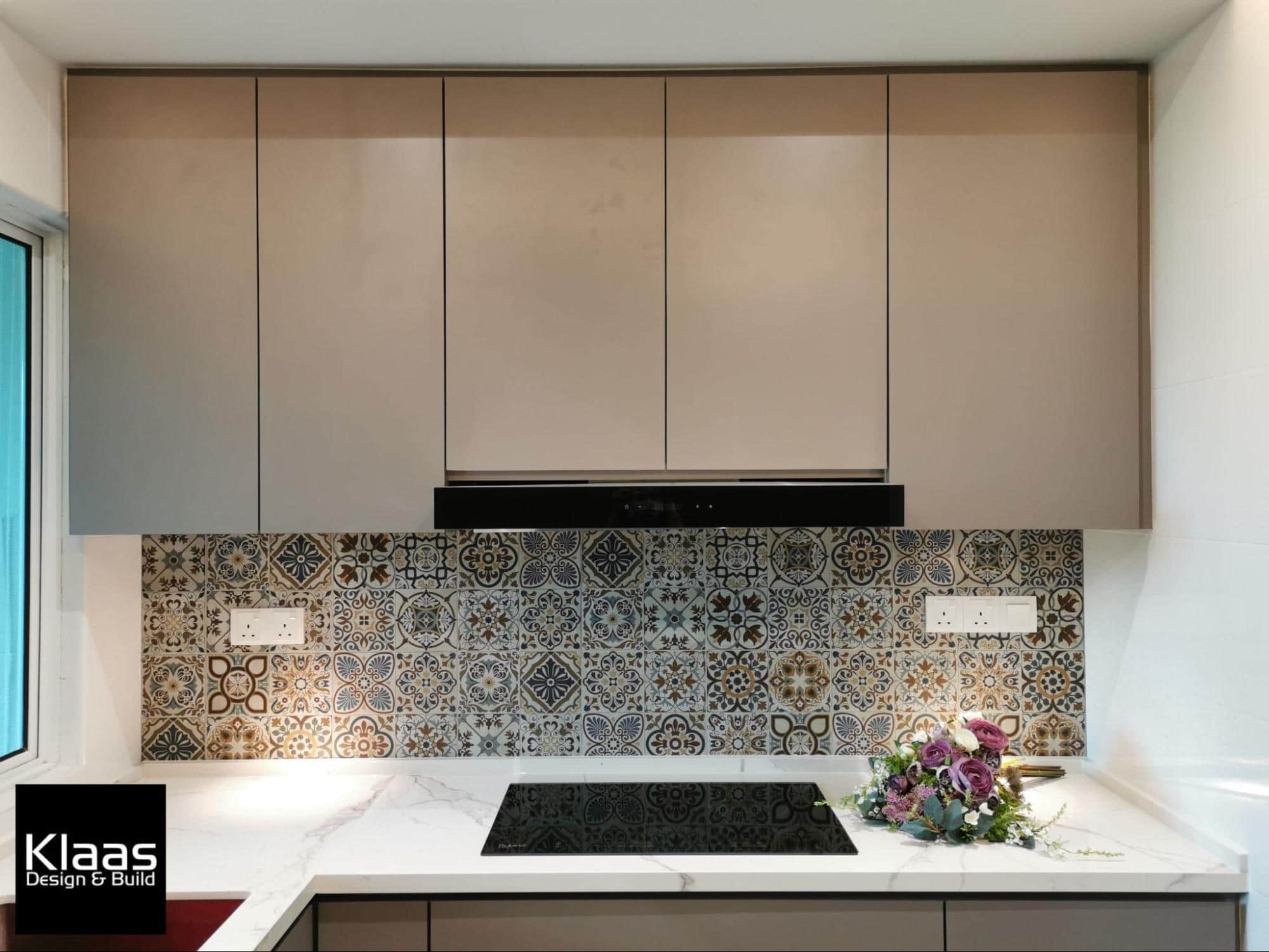
The kitchen backsplash takes the cake as the visual highlight of this room. The designers applied entrancing Talavera tiles to stand out against the plain textures for a stark yet pleasing contrast.
Stairway
The client also happens to be a wine collector and wanted a cool, dry place to store them. For this, the designers decided to utilize the dead space under the stairway and turn it into a classy wine cellar.
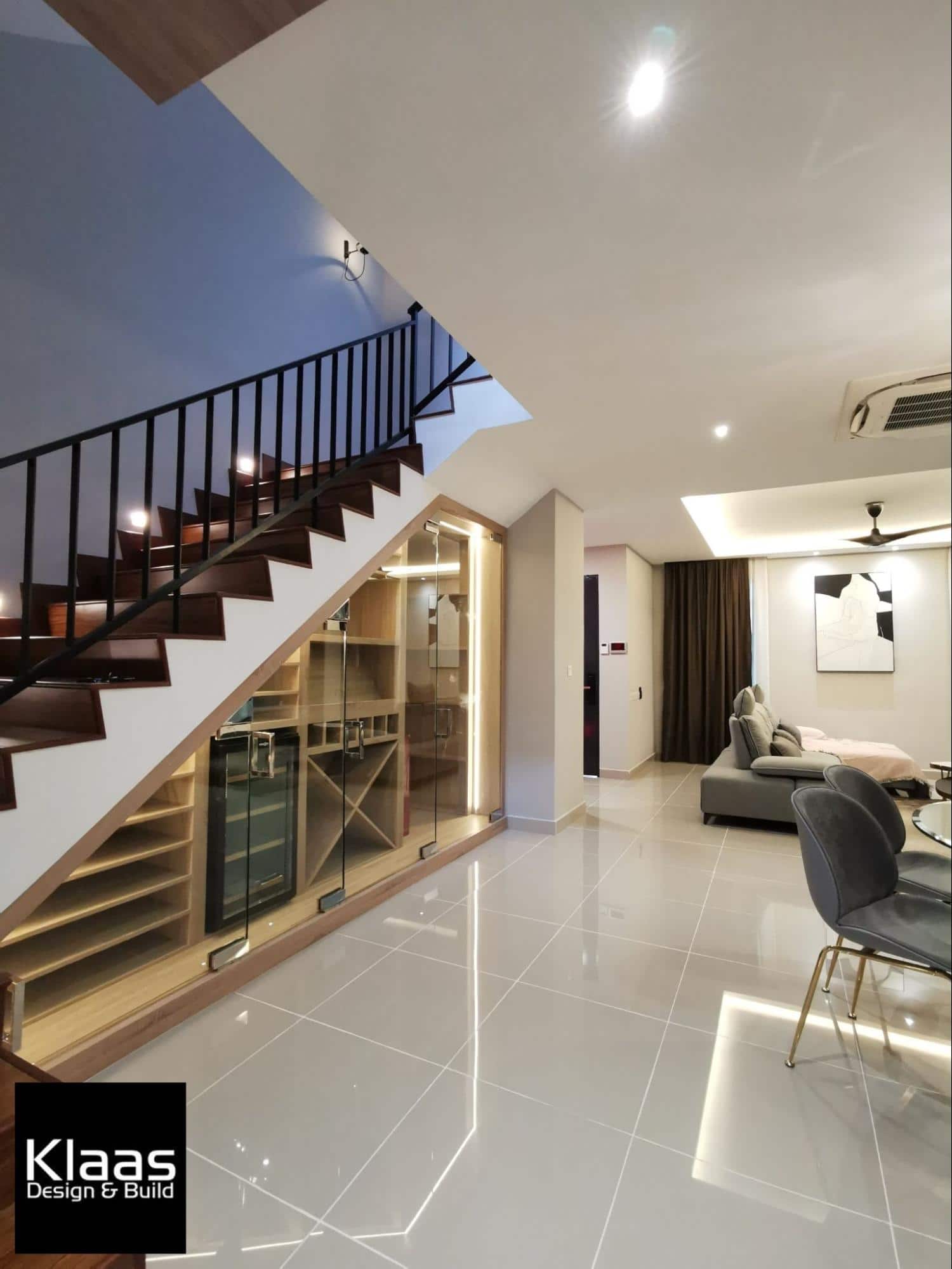
The cellar features a variety of custom shelves to showcase the client’s bottle collection. Each side is lined with bright LED lights, subtly brightening the niche and lending a captivating view to the entire room.
Instead of closed panels, frameless glass doors lining the opening provides access to the entire shelf.
Mother’s bedroom
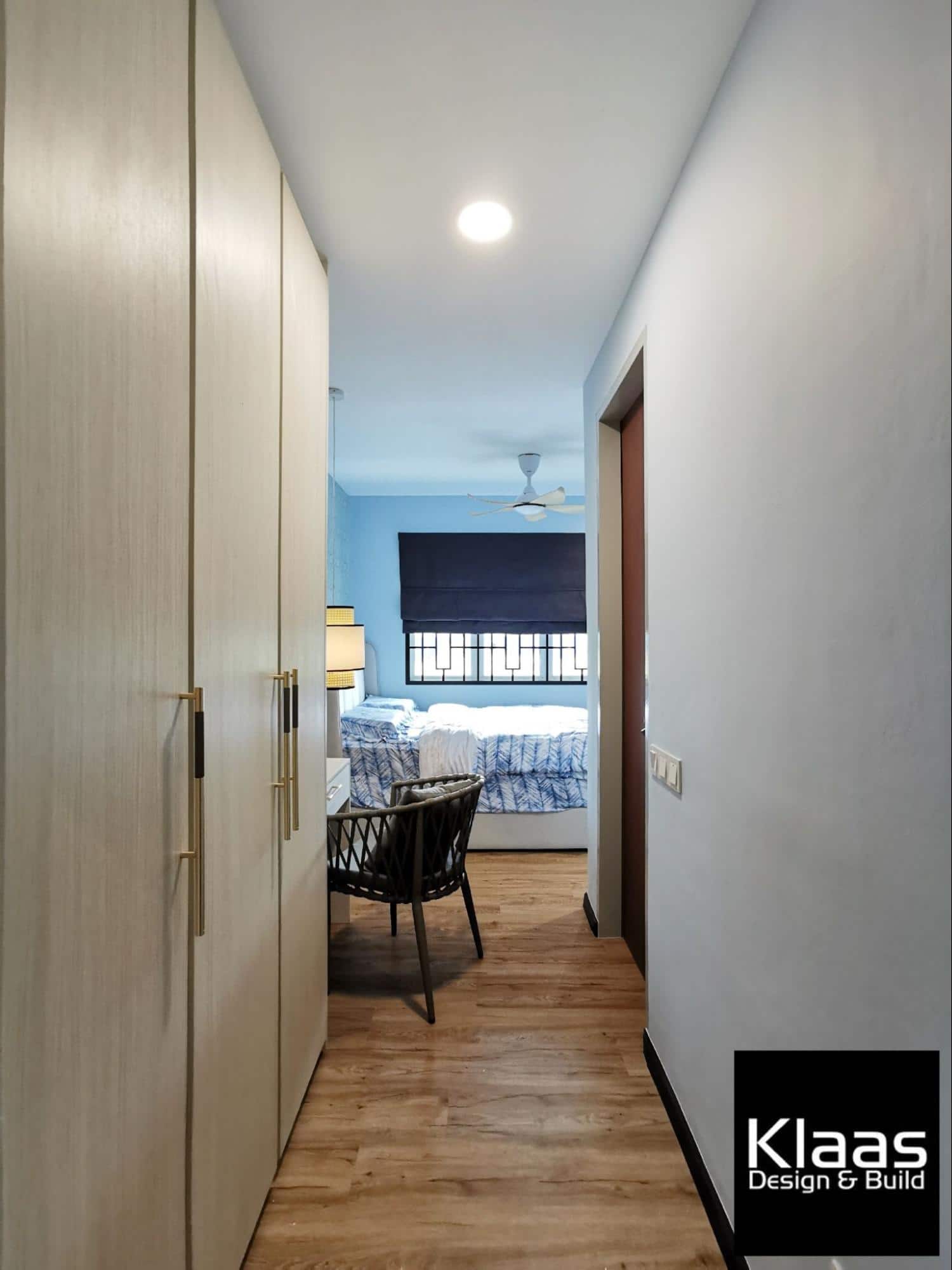
A little bedroom downstairs is provided for the client’s elderly mother for easy access. The design of this room is effortless yet refined with a hint of heritage design.
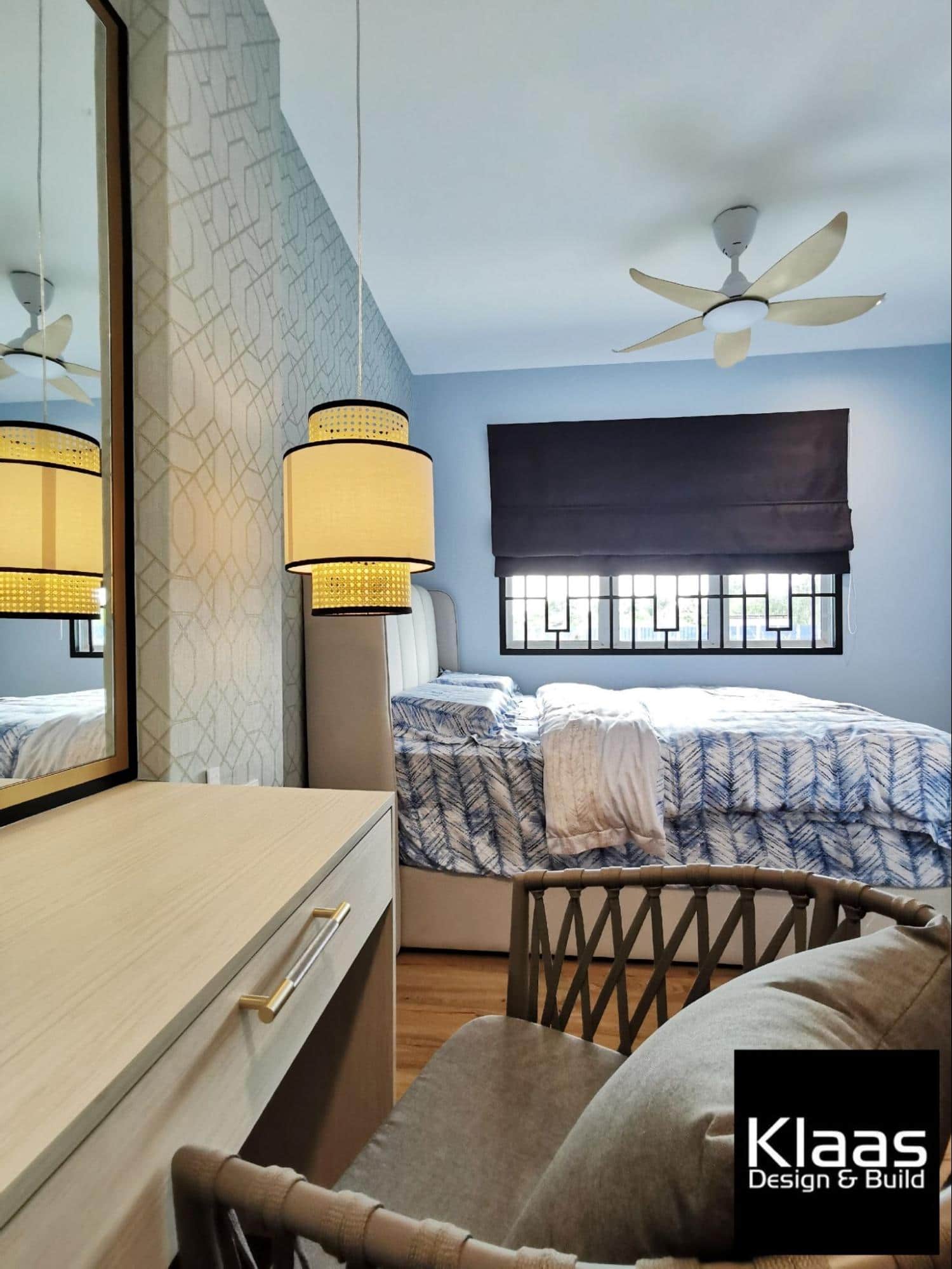
Blue tones catch the natural light seeping in and instantly brightens the room of sleek lines and patterns. A suspended modern woven lamp glows ambiently beside the bed.
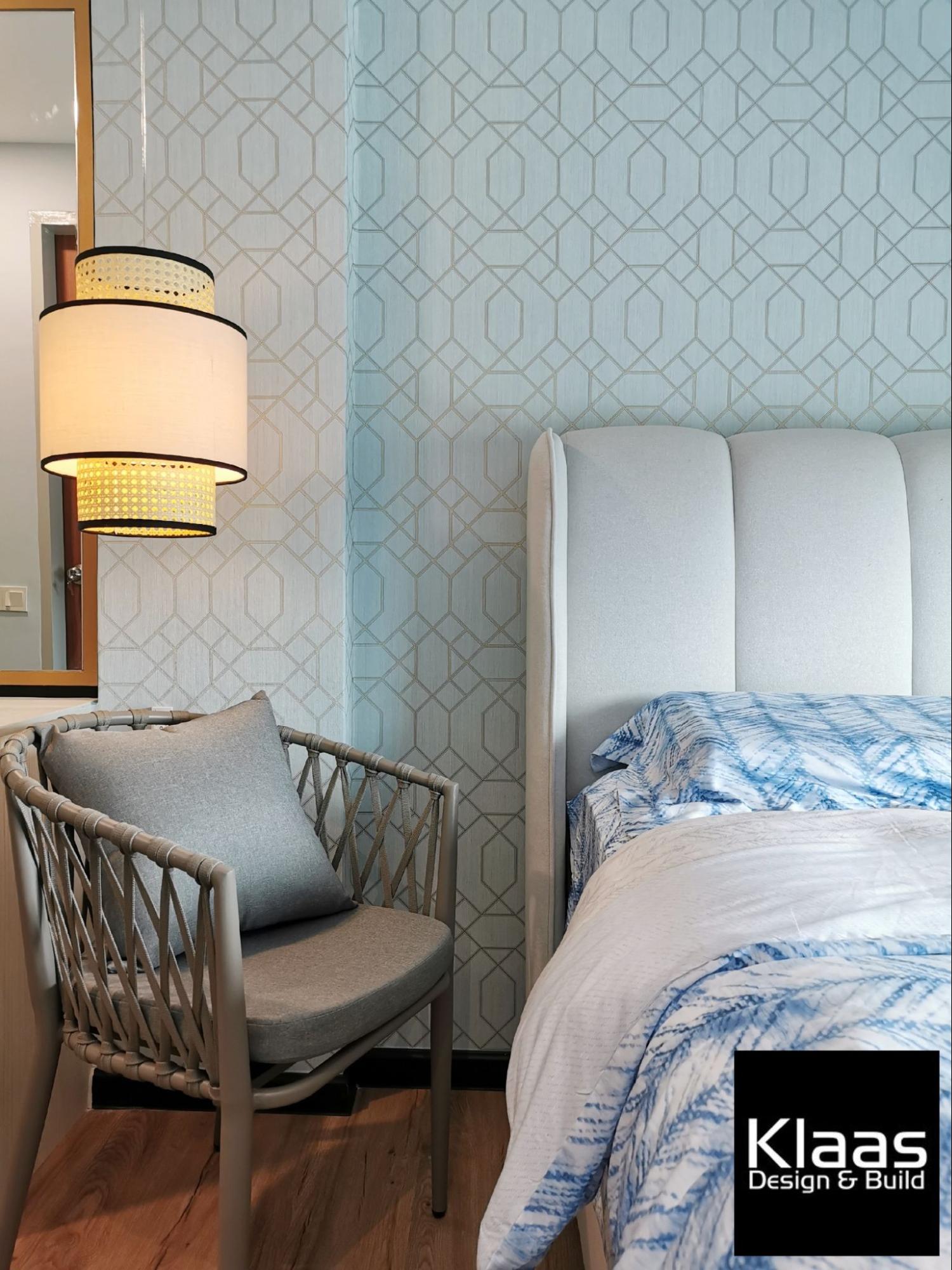
The modest bedroom also comes with a built-in closet, a dressing table with a large mirror, and an attached bathroom.
Study area
Up on the first floor, the spacious foyer is converted into a sleek study area for the family to work in.
A bank of Scandinavian inspired built-in cabinets is installed for storing books and stationery, with a lengthy study desk extending forward by the wall. It also comes with drawers and plug points underneath.
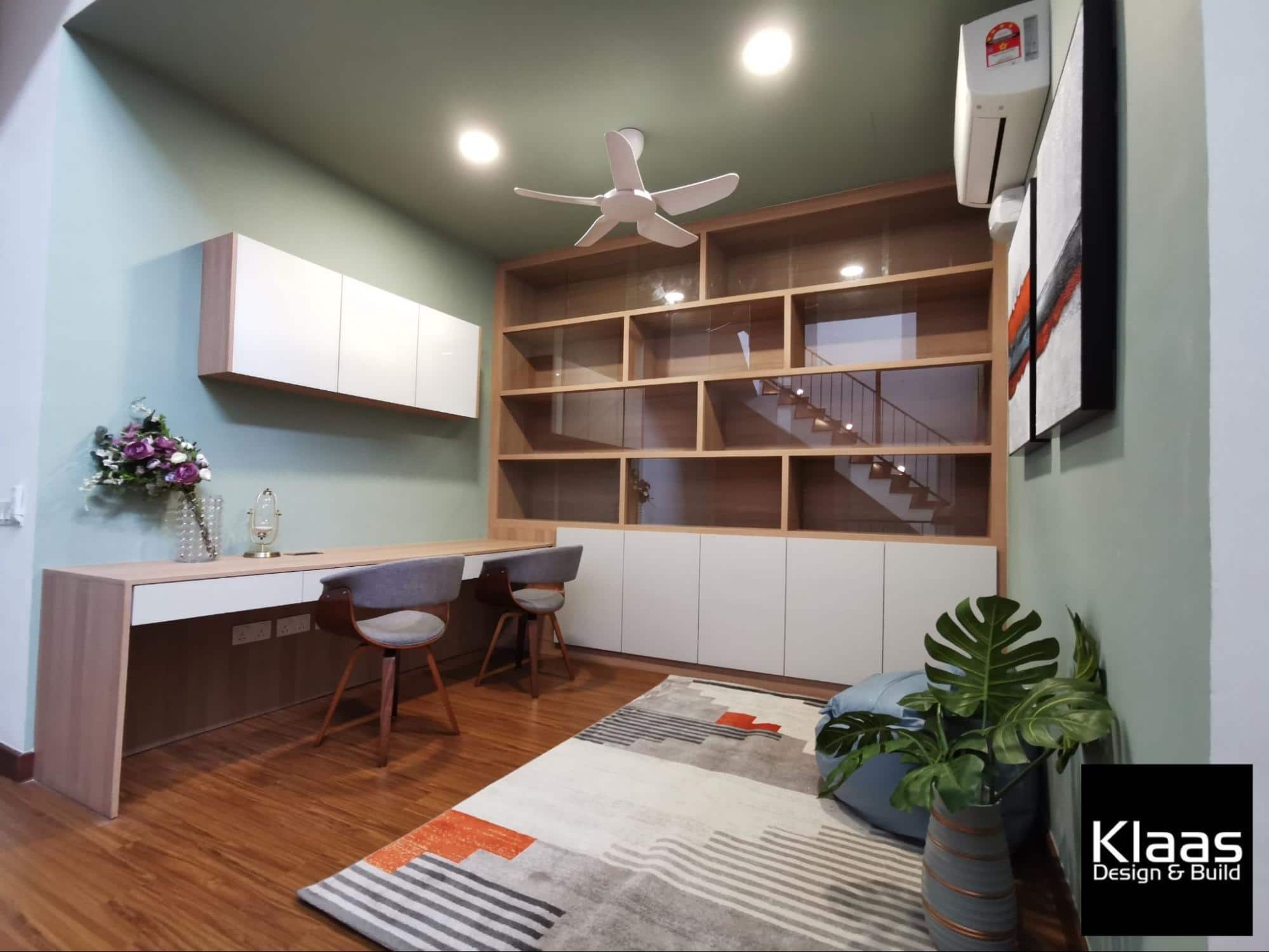
A cute bean bag spot with a colourful rug and contemporary posters contrast the sage green walls, creating a cozy little nook to study or spend a lazy afternoon.
First son’s bedroom
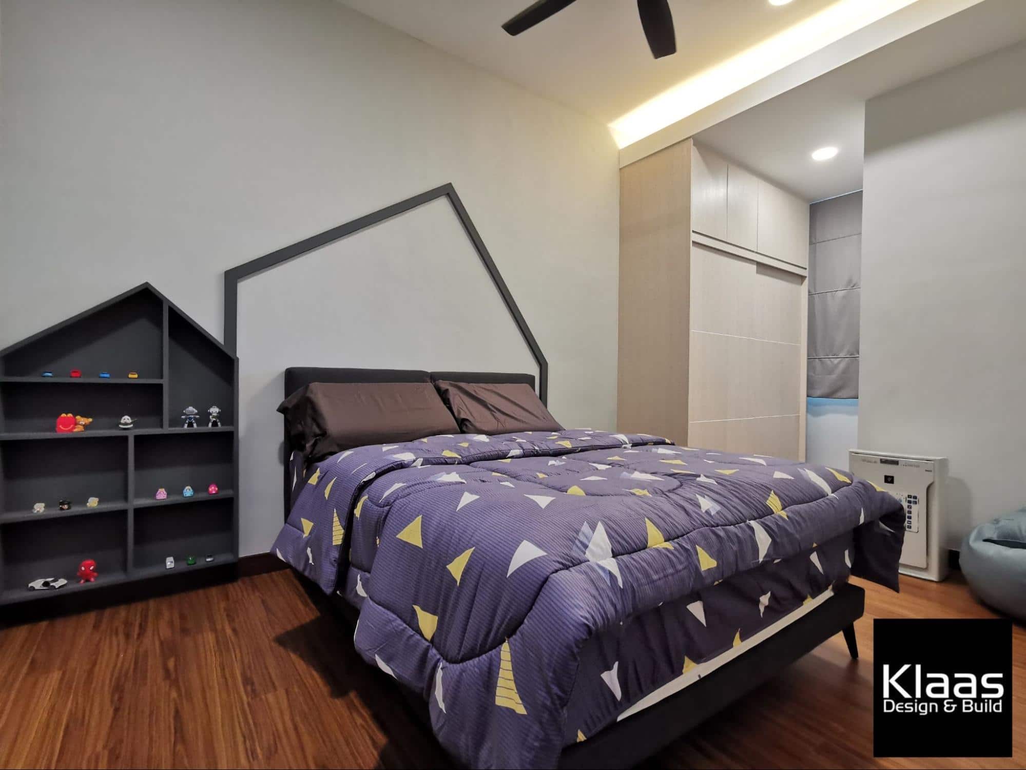
Each of the client’s children gets their own bedroom and this one singles out due to its unique wall feature. Like all the other rooms, it comes with an attached bathroom and a simple built-in closet by the window.

Although modestly furnished with a double bed and bean bag at the side, the bedhead wall comes with a custom-made geometrically shaped shelf for displaying the son’s favourite novelty figurines and toy cars.
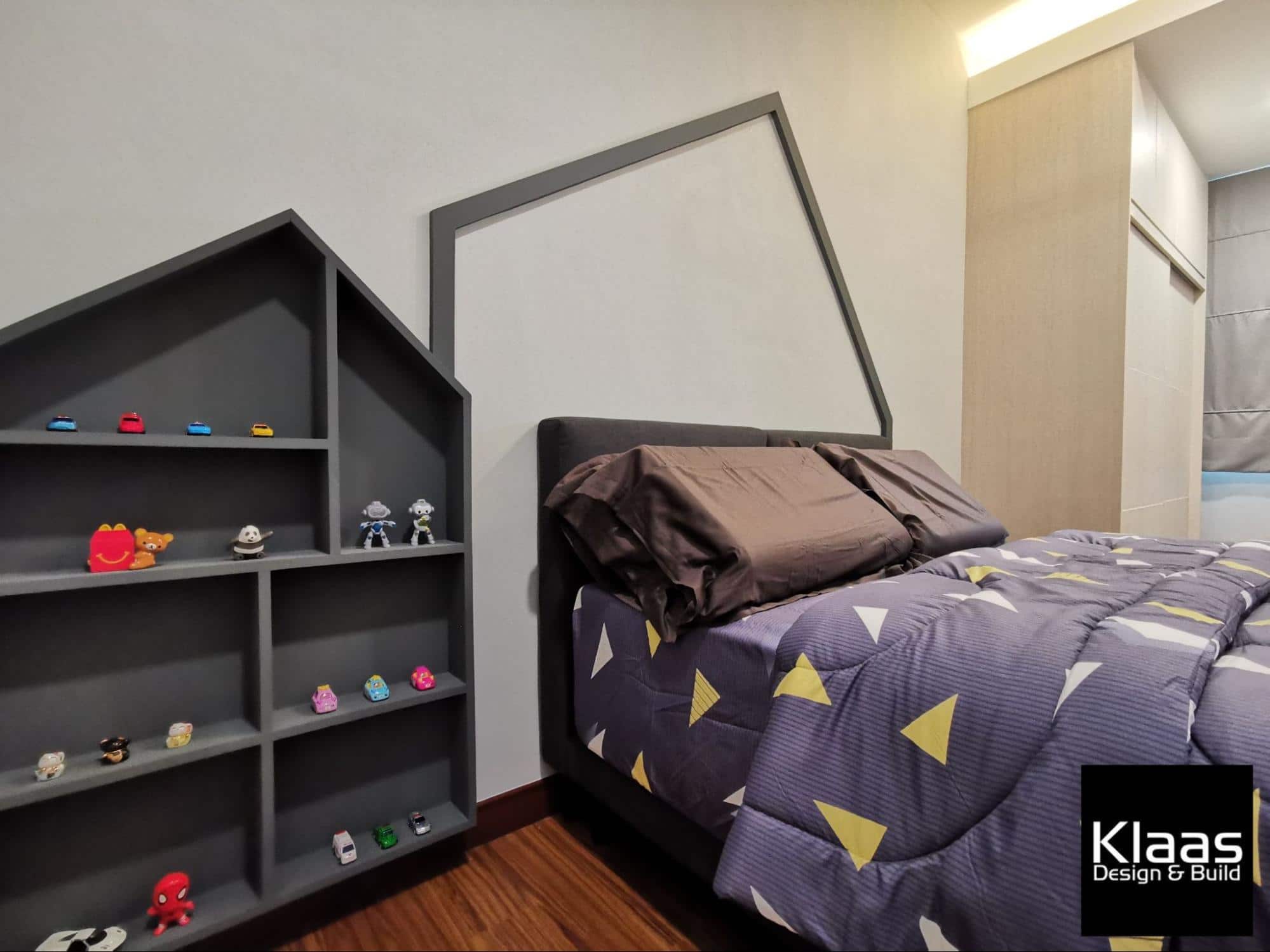
With the room’s timeless design, it can easily adapt over the years as the boy grows older, therefore, making it perfect for a family home.
Second son’s bedroom
The next bedroom is met with a funky combination of colour. Yellow accents balance against the symmetrical pattern wallpapered feature wall smoothly without overwhelming the room’s overall energetic vibe.
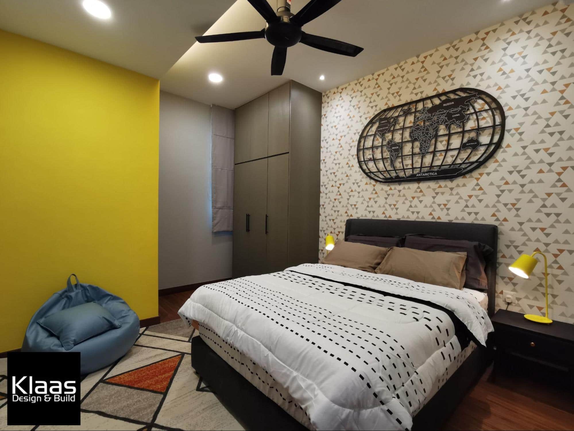
A darker-toned cabinet takes residence in the corner opposite the attached bathroom. The bedhead wall also includes a Winkel Tripel projection world map above the bed for decoration.
On each side of the bed, yellow table lamps are paired with black bedside tables to strike a bright contrast that turns this funky little bedroom into a cheerful space.
Guest bedroom
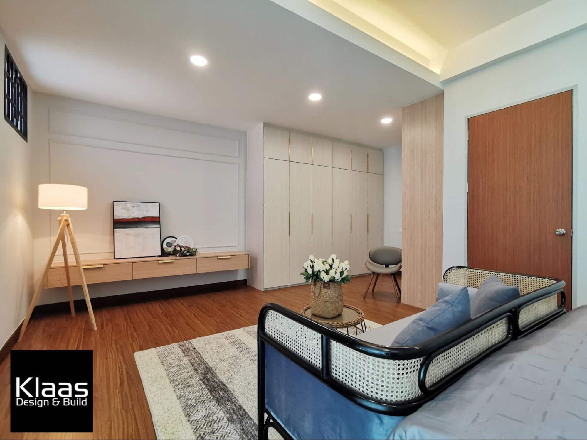
This hotel-like bedroom is crafted with impeccable classical taste that the clients had in mind to keep their guests feeling comfortable and welcome.
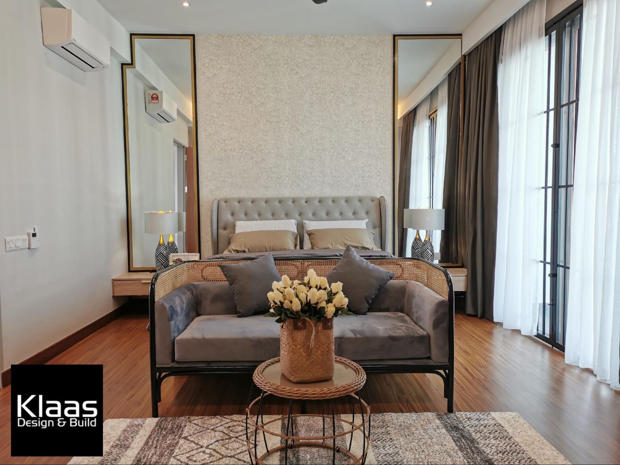
The stunning light-filled view washes over the vintage features lent by the heritage-inspired sofa and coffee table made of rattan and black steel.
A grey tufted headboard leaning against a neutral abstract wallpaper comes with gold-bordered full-length mirrors and quaint lamps on each side.
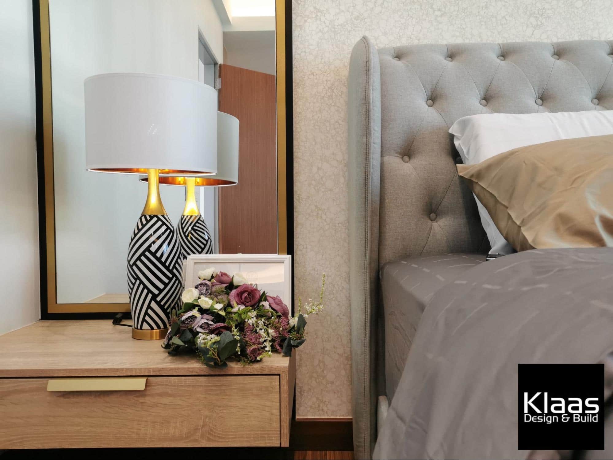
On the opposite wall, a floating console cabinet matches well with a wainscot wall to place miscellaneous items or even to fix up a TV.
A 3-legged lamp sits by the left corner to lightly illuminate the room with a white built-in wardrobe on the other end.
Master bedroom
It is the only room that occupies the second floor and is beautified with a delicate classical theme.
Wainscotting patterns on a plain grey wall seamlessly contrasts the metallic decorative piece above the bed, enhanced by the golden sheen of the hanging bedside lamps.
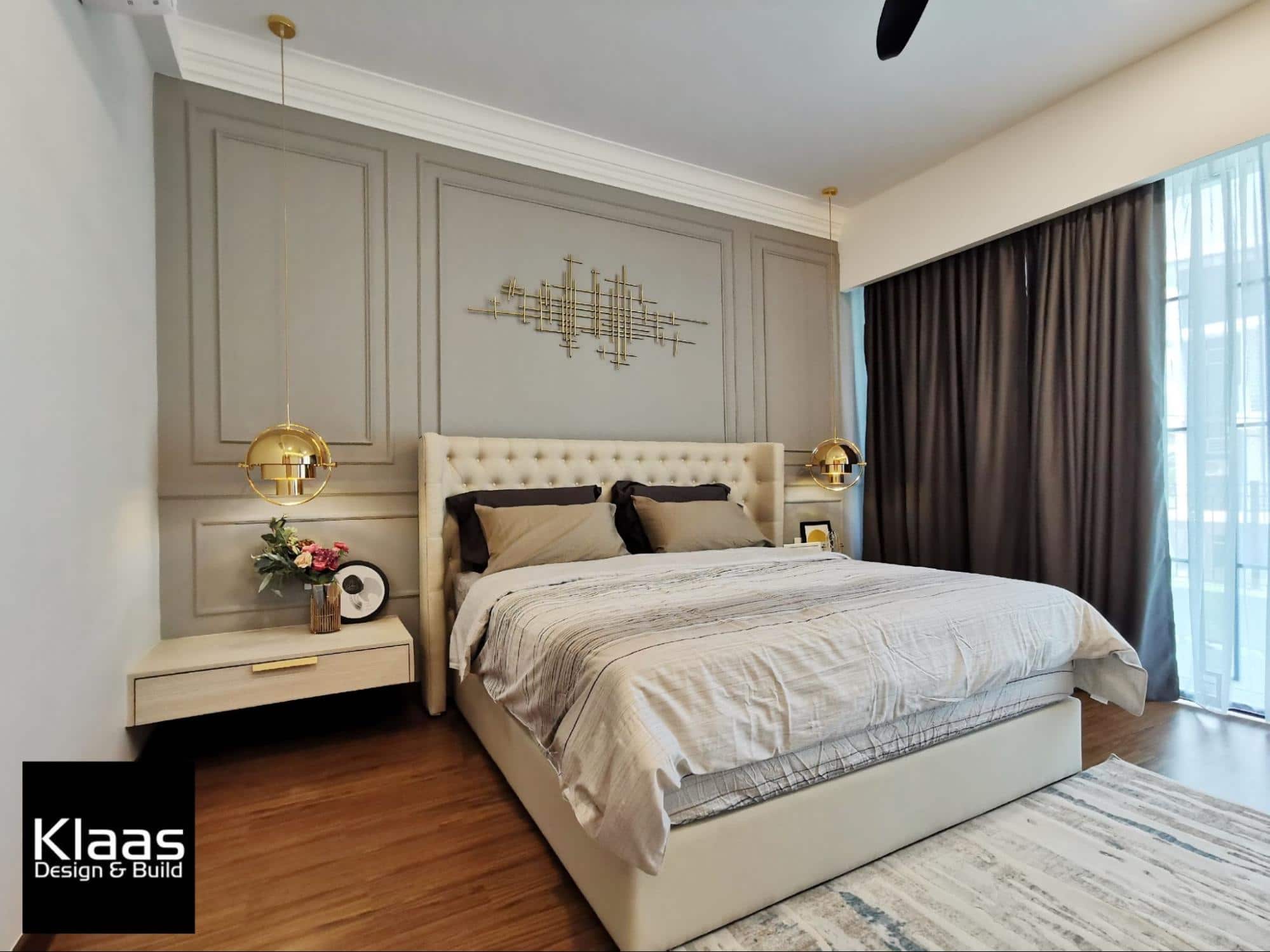
Beige bed frames and floating bedside tables supplements a classy touch that creates an enchanting luxurious design.
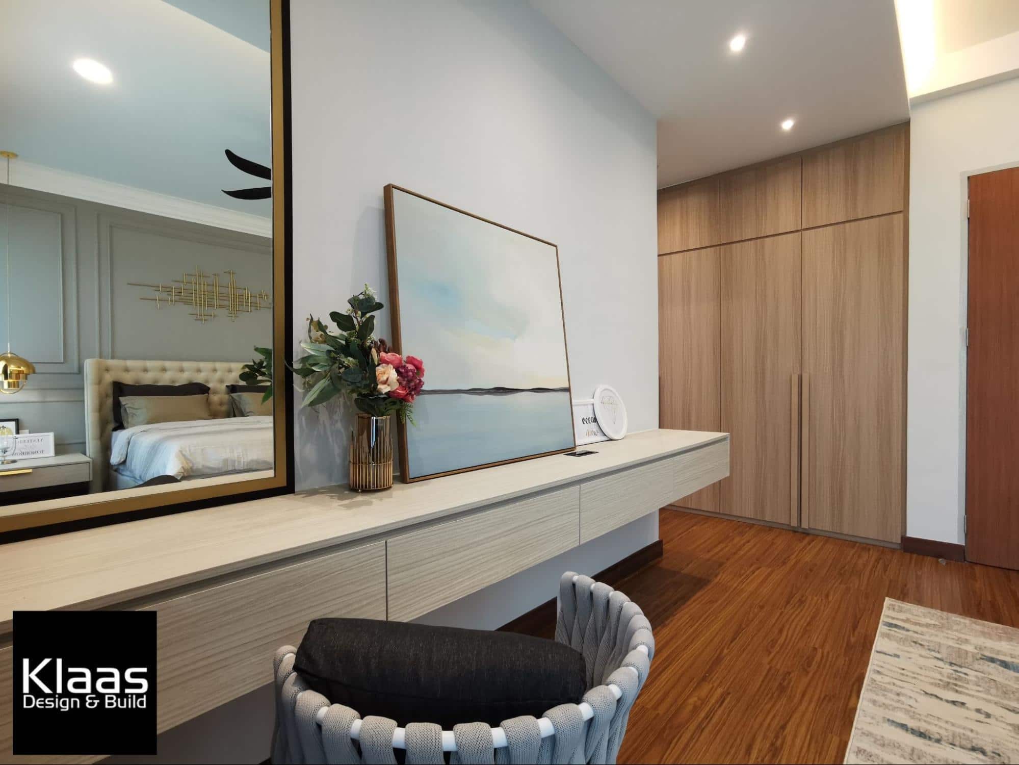
The large mirror on the built-in dressing table lends a vintage sense amidst the art poster and little decorations.
On the far side of the room, a custom made wardrobe takes up the entire wall with tan coloured laminates to match the surrounding pale accents for a deeper luxurious vibe.
Balcony
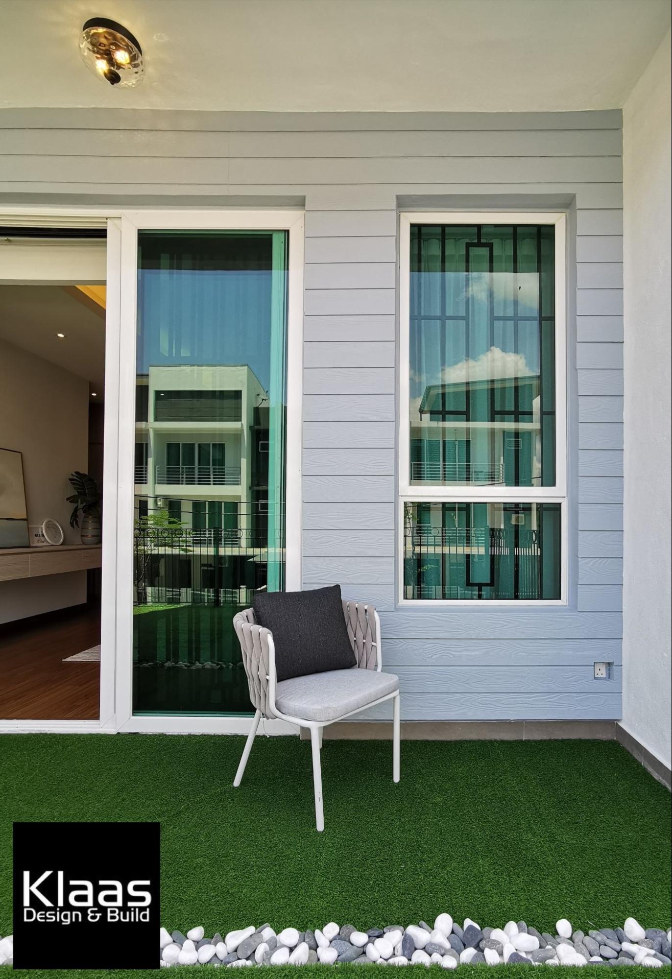
The unique quality about the extended balcony just outside the master bedroom is how much it resembles a vibrant garden.
Fake grass patches cover the floor and bask under beautiful blue skies during the day, like a petite garden above ground.
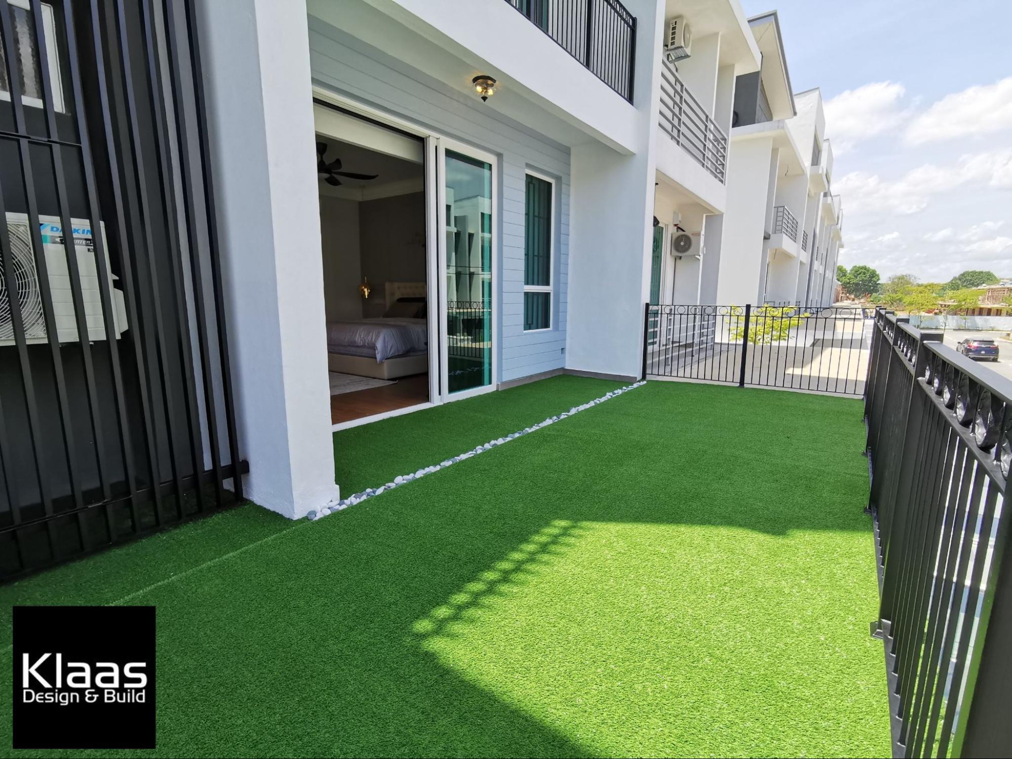
For an outdoorsy flair, marble stones line the separation between the balcony and its extension. A simple lawn chair or bench can be placed for lounging or to simply enjoy the scenic view on the grass.
Wood planks painted baby blue were installed to the walls to even resemble a classic porch front which completed the look of this cozy home.
A dream home come true
In the end, the home was a perfect emulation of the client’s vision. The total cost of the renovation and design amounted to RM380K.
Project details
Location: Tanjung Lumpur, Kuantan, Pahang
Property size: 2,800sqft 2.5 storey terrace home
Price: RM380K
Purpose: Own stay
Design: Modern Classical
Works done: Wet works, built-in cabinetry, feature wall, TV console, loose furnishing, flooring, painting and wallpaper installation, wainscotting, lighting, plaster ceiling,and decorations.
Designer: Leslie Tan from Klaas Design & Build


